TRANSPOREON
DATE 2015-2017
ROLE
Research, UI/UX, Mobile Design, Usability-Test
OVERVIEW
TRANSPOREON app is the innovation in transport and logistics. It' an Android app that links drivers smartphone or tablet PC with shippers, enabling end-to-end real-time processes, paperless dispatch and visibility right up to the end customer. Any new orders, re-routing, address changes or cancellations are sent directly to drivers device.
The driver receives all transport documentation as electronic files on the smartphone/tablet PC. On arrival, the driver simply ask the recipient to sign on your device screen. Goods damage can be recorded and the driver can use the device camera to include photographic proof if the shippers workflow requires them.

PROCESS
USER RESEARCH: I watched and listened as the drivers works. I don't usually give the user tasks or scenarios.To understand what a driver is doing or thinking I asked question.
PROTOYPING & DESIGN: We completed a few rounds of updates to ensure the wireframes included everything we needed then moved on to designing the UI.
TESTING: Testing the app in the drivers environment.
CONTEXTUAL INTERVIEWS
It is a good way to combine observations with interviewing. By going to the driver, I see the user's environment and the actual technology the user works with. As a result, I was be able to answer questions such as:
Any issues that users are facing
Equipment they are working with
How their space is set-up
Preference between tablet and smartphone
How long does it take to complete common or target tasks

PROTOTYPING & VISUAL DESIGN
Imagining I am driving, I need something quick to relate at. No reading, no distracting, just a very quick peripheral vision feedback.Feedbacks about the transport orders, positive (new orders) and negative (cancelled orders), should be short and concise.When representing a problem, a precise color code should vehiculate the information, direct and based on common sense.More specific information about the transport should be put on a second layer of information, since they’re slower to be read.


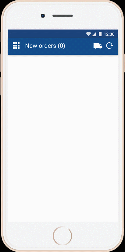
DASHBOARD
The user can jump into his orders, can set a vehicle status oder do settings.
VEHICLE STATUS
Easy, direct forwarding of status messages from the vehicle, e.g. "Goods successfully loaded", "Delay due to congestion", "Break"

ANIMATION
Status message for no orders
If the driver has no orders in his order list, an simple animation appears for the status "no orders".
Also, it’s essential to provide necessary information like a helpful tracker that monitors an order’s status.
MORE IMPRESSIONS ABOUT THE APP
 |  |  |  |  |
|---|
TESTING
Conducting the mobile app test with a driver, I try to do nothing more and nothing less than be a gracious guest.I asked most of my questions before the driver starts a ride or after the driver finished it.
Also I asked some questions carefully when we stand in the traffic jam or stop at a red traffic light, but make sure answering them does not require more than 1-2 clicks in the app or much thinking.

OTHER PROJECTS AT TRANSPOREON
Redesign of registration centre
My role in this project was the redesign of the whole registration centre of TRANSPOREON. This includes guidelines enclosed rules for the use of typography, images, icons, buttons, etc. and a colour scheme for different types of modules. With lot's of white space and the new accent colors, an optimal user experience was created. The registration process for the new customer should be simple and clear, with a big focus on creating a welcoming feel.
