1&1 IONOS
DATE 2018-2019
ROLE
-
Working as an UX/UI Designer with a cross-functional team for the pro unit of the website 1&1 IONOS
-
Working together with the 1&1 teams, who are responsible for the small business unit of 1&1 IONOS
-
UX, Visual Design, Branding for the 1&1 IONOS website
OVERVIEW
In 2018, to build upon its vision of empowering businesses to leverage the latest digital technologies, 1&1 combined its web hosting, applications, and server product lines with ProfitBricks’ cloud infrastructure solutions, becoming 1&1 IONOS and reaffirming its dedication to innovation and customer centricity.
Proud of its heritage, 1&1 IONOS will continue its mission: to make powerful technology work for everyone, and to deliver the best of cloud computing. 1&1 IONOS is a member of the United Internet group.

PROCESS
-
USER EXPERIENCE: Working with data collected during the research phase, I was able to set up user flows which we reviewed with the team. After that, we continued with the first version of wireframes.
-
NAVIGATION: Creation of a click-protoype to communicate and test my ideas.
-
STYLEGUIDE & SPECIFICATION: Creation of a cohesive styleguide and ensuring that a consistent design language is applied across the product.
-
UI PROTOYPING, INTERACTIVITY AND ANIMATION: I used InVision to handle feedback, communication and make prototypes. Usually, the pro and smb team upload the latest version of the wireframes (and later on designs) and record voice-over videos to walk through all the new changes and updates. We completed lots of rounds of updates to ensure the wireframes included everything we needed. After that we moved on to designing the UI.
-
DEVELOPMENT: Responsibility for cooperation and work closely with developers.
USER FLOW & WIREFRAMES

PROTOYPING & VISUAL DESIGN

STYLE GUIDE & SPECIFICATION
Pattern Library – A subclass in the design system, this is the set of design patterns for use across the smb and pro team. It was important to have a guide to keep the UI consistent.For the project it was extremely important when multiple designers are working on a big website.s important to have a guide to keep the UI consistent.For the project it was extremely important when multiple designers are working on a big website.

OUTLINED ICON SET
Here's a preview of the extension of our current system icon. The task was to create a bold and sleek line style icon set that was consistent with their brand mark. You can expect to see this on the 1&1 IONOS pages.
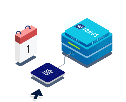
ISOMETRIC ILLUSTRATION
The isometric illustrations should have a simplicity of flat design and an added depth and dimension that makes that makes each element more visually appealing and easier for the user to understand.
Isometric illustrations sets with shapes and elements that look real in combination with bright color schemes.

ISOMETRIC MOTION GRAPHIC
The proper implementation of motion design helps ensure better quality user experiences for the brand 1&1 IONOS. We used animated illustrations to communicate with users.
UNUSED CONCEPTS & EXPLORATIONS

