IU INTERNATIONAL UNIVERSITY OF APPLIED SCIENCES
DATE 2019-2025
ROLE
Working as an Senior UX/UI Designer with a cross-functional team for the website fernstudium
UX: Rebuild the Information Architecture (IA) for the website to meet the needs of the users
UI Redesign: Make sure that the redesigned website is in line with the brand’s identity and guidelines.
Testing & Evaluation: Usability Testing, AB Testing
OVERVIEW
My role in the website rebranding project was to ensure that the website not only looks appealing but also proved a seamless, user-friendly and acessible expierence that aligns with the brand identity and meets the needs of the target audience.

PROCESS
REBRANDING: Collobrating with my team of UX Designers for the website rebranding project enhances design consistency, streamlines the workflow and promotes a unified design approach throughout the rebranding process.
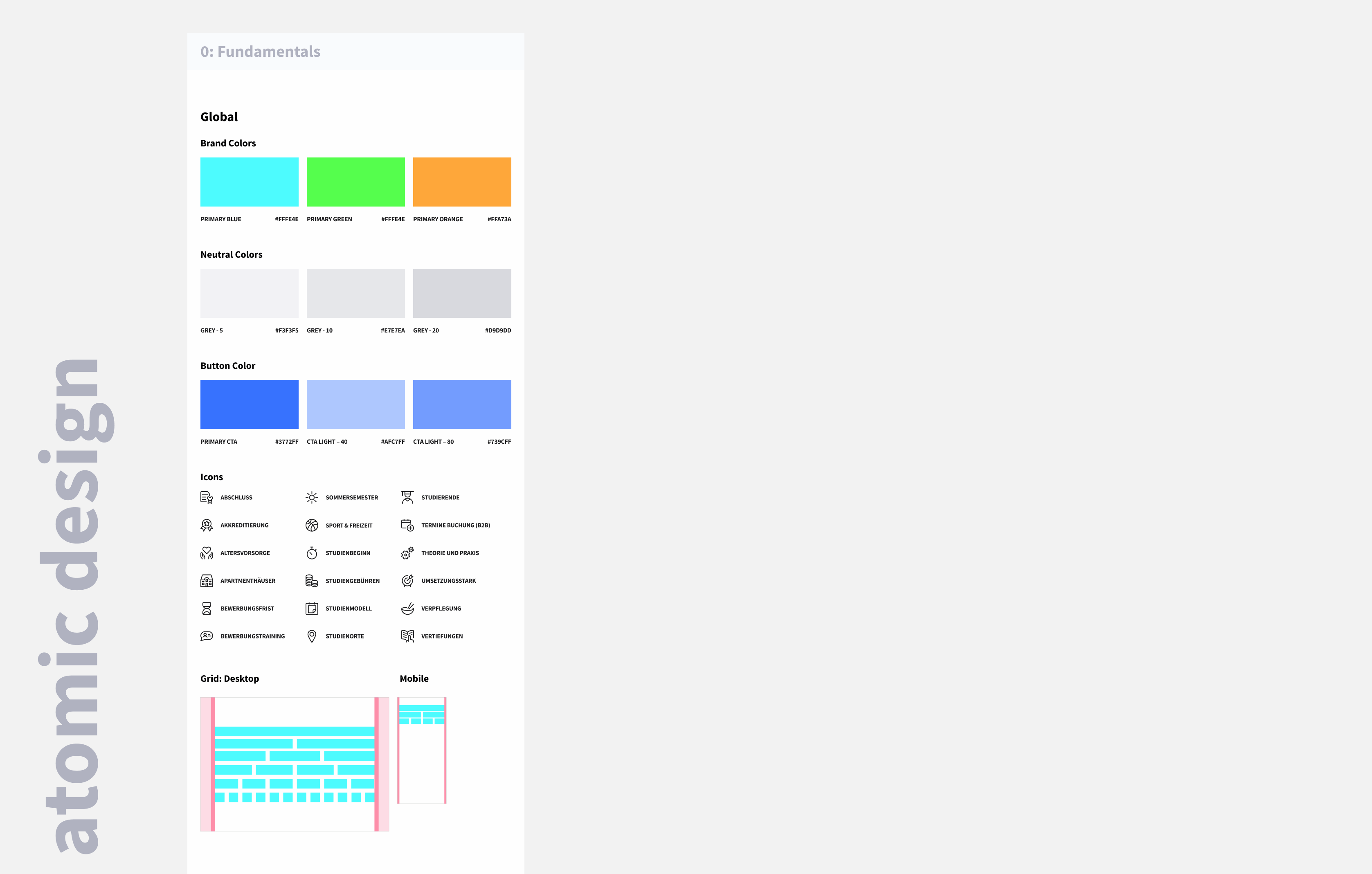
DESIGN SYSTEM: Working with data collected during the research phase and the rebranding templates, we were able to set up a design system from the scratch, which includes all atomes & molecules. We reviewed the foundations with the team. After that, we continued to work on the design system to have a cohesive styleguide and ensuring that a consistent design language is applied across the product.
MOCKUPS: We created the first version of the rebranding mockups with a lot of design iterations.
UI PROTOYPING & INTERACTIVITY : I used figma to handle feedback, communication and make interactive prototpes to visualize the propsed changes. We completed lots of rounds of updates to ensure the mockups included everything we needed.
DEVELOPMENT: I was responsible for the unit distance learning and worked closely with developers. Designing with implementation in mind helps to simplify and speed up development process.
AB TESTS & USABILITY TESTS: By creating and testing design prototypes quickly helps our team visualize how the breanding elements will work in practice.
CONTINOUS IMPROVEMENTS: After the rebranding was completed, I may continue to monitor user feedback and analytics to identify areas of ongoing improvements.
REBRANDING CI
With the help of the company gmk-Markenberatung, the university carried out intensive analysis for its new path. “Among other things, we carried out interviews with employees or target group testing, as well as regular brand language workshops, awareness and image tracking, surveys among students, teachers and customers or permanent A/B website tests,” says Versfeld a selection of the comprehensive measures.
THE NEW BRAND APPEARANCE: BOLD, LOUD, FLEXIBLE.
At IU, people are the focus! High-contrast images are the stage for strong, self-determined characters, which are focused by the IU's central brand code, the neon frame. The IU color spectrum is made up of 6 bright neon colors that are used strikingly - for example to underline bold headlines. Because: The IU world is not only colorful, but also self-confident. You can see and hear that!
The challenge
Homogenize the brand identity along the entire customer journey with strong, recognizable and emotional brand codes (in IU’s case such as the frame, neon colors, customer focus, bold headlines).

 |  |  |  |  |  |
|---|---|---|---|---|---|
 |  |
DESIGN SYSTEM
Building a design system with UX Designer from other units was an iterative process. Regular communication and feedback helped refine the system and ensure its effectiveness in promoting a cohensive and user-friendly experience across products. Also the collaboration between our ux team and the developers was crucial when building a design system.
Continous Collaboration
The design system is not static and evolves over time.Regular collaboration ensures that the design system remains up-to-date and aligned with overall project goals.
WIREFRAMES & DESIGNS
Reserach
A good UX redesign starts with studying the existing UI, as it is the best prototype for your new product.
My UX analysis includes investigating and assessing how users interact with the UI of the website or landing page and using the collected data to improve the user experience. The aim is to enhance the user flow and the product’s ease of use.
Wireframes
The next step in the process was to move each of the pages to Figma to explore possible design alternatives and come up with a high fidelity wireframe in terms of how the content hierarchy would be displayed.
UI Redesign
The following phase was developing the details; it needed to end up being ready to fit the organized layout. The text hierarchy, graphics, as well as images, required to end up being coherent with the overall look & feel and delivering the message precisely.


CONSTANT TESTING & ITERATIONS
Usability & AB Testing
Finally, we tested our redesign with users, preferably users of the previous iteration of the product. Get feedback on what they like about the new design and what may frustrate them. User testing will help determine if there are any real usability problems with the redesign. If there are, continue to iterate on the redesign until the user experience is working the way it should.
AB Testing
Working closely with the cro team ( conversion rate opimization ) is important for aligning design efforts with conversion goals. A/B testing assess user behaviour and the cimpact of design changes on conversion rate.
AB TESTING AFTER REBRANDING
Element level testing
Testing Variables
We selected variables we wanted to test, such as button colors, background colors, or even the headline colors. By focusing on one variable at a time, we could isolate its impact and gather precise insights. By conducting A/B testing, we can further refine brand colors to achieve optimal results.
Button Testing
Button color plays a vital role in shaping user behavior and driving conversions on websites. We tested our brand color button against black and a blue button.
PAGE-LEVEL TESTING
As the name suggests, this testing involves moving elements around a page or removing and introducing new elements.
Multi-step vs. One page-Checkout
For example in our online application, the previous concept was a Multi-step checkout, which spread out the steps of an online application into several pages.To optimize the online application expierence, my idea was to shit to a one-page checkout model, reducing the number of steps and clicks troughout application process to save the users time.
Everything on a single page
The new concept is an accordion checkout. It involves a series of application steps that exist on a single checkout page, but wich promt the user one section at a time. Once information is properly entered into one section, the user proceeds to the next section, guiding the user along the process of data entry. Users are unable to proceed to the next step until the preceding step is complete, making difficult to miss a necesssary field of information.
Benefits of the new concept
- Less steps and fewer clicks will keept the process short, simple and frictinless
- One-page are easier to use for the users, with limited steps being required of the user.
- Navigation is fluid and guided and more clear as you don´t need to navigate trouth multiple steps


SETTING UP & ANALYSING AB TESTS
I have also collaborated with the cro team to create and analyse A/B tests. For A/B testing, we used the tool AB Tasty.
Setting up the tracking and reporting
After I have created the variations for the A/B test, the next step is to set up tracking and reporting to measure the performance of your experiment.
We use Google Analytics for analysis to track key metrics related to the goal of your A/B test and to make data-driven decisions.

USABILITY TEST
For qualitative feedback, I conducted many usability tests to gather feedback from the users.
Information Architecture
The goal of the information architecture for the study courses is to classify the content in a clear and understandable way and arrange it according to relations between the content pieces, allowing users to find what they need with less effort.
Visitor flow testing: The challenge when building a new information architecture for the study courses s in understanding how the website works from the user´s perspective.Therefore a Usablity Testing was very useful how to optimize visitors’ navigation of the site.

RESULT: DATA-INFORMED SUCESS STORY
IU’s success story
As of March 2021, IU International University of Applied Sciences is Germany's largest university, with a market share of 68 percent. A key success factor for this was the new brand strategy launched in 2019. Up until that point, branding had not played a role at IU. Despite its enormous growth of 490 percent within four years, awareness was only 0.15 percent.
Thus, the former IUBH became IU International University of Applied Sciences. Within two years, its brand awareness increased by ten percent and the monthly user numbers doubled.
“Within two years we were able to double the monthly user numbers while simultaneously reducing the costs per applicant and increasing the user to lead conversion rate.”
